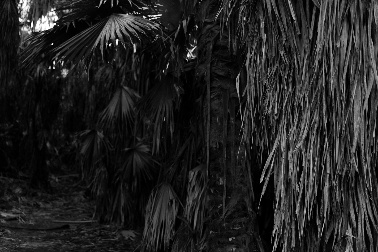
This photo I like mostly due to how it displays details and depth.
I think it probably could’ve been a little bit brighter.
There’s a sense of space that doesn’t quite carry across when you’re in the actual area. It probably has a lot to do with the framing.
This is my submission into Leanne Cole‘s “Monochrome Madness” for this week.
I suggest checking out Leanne’s photography, as well as checking out what other people submit.
A lot of what people are submitting will likely end up here.
I hope you enjoy.