
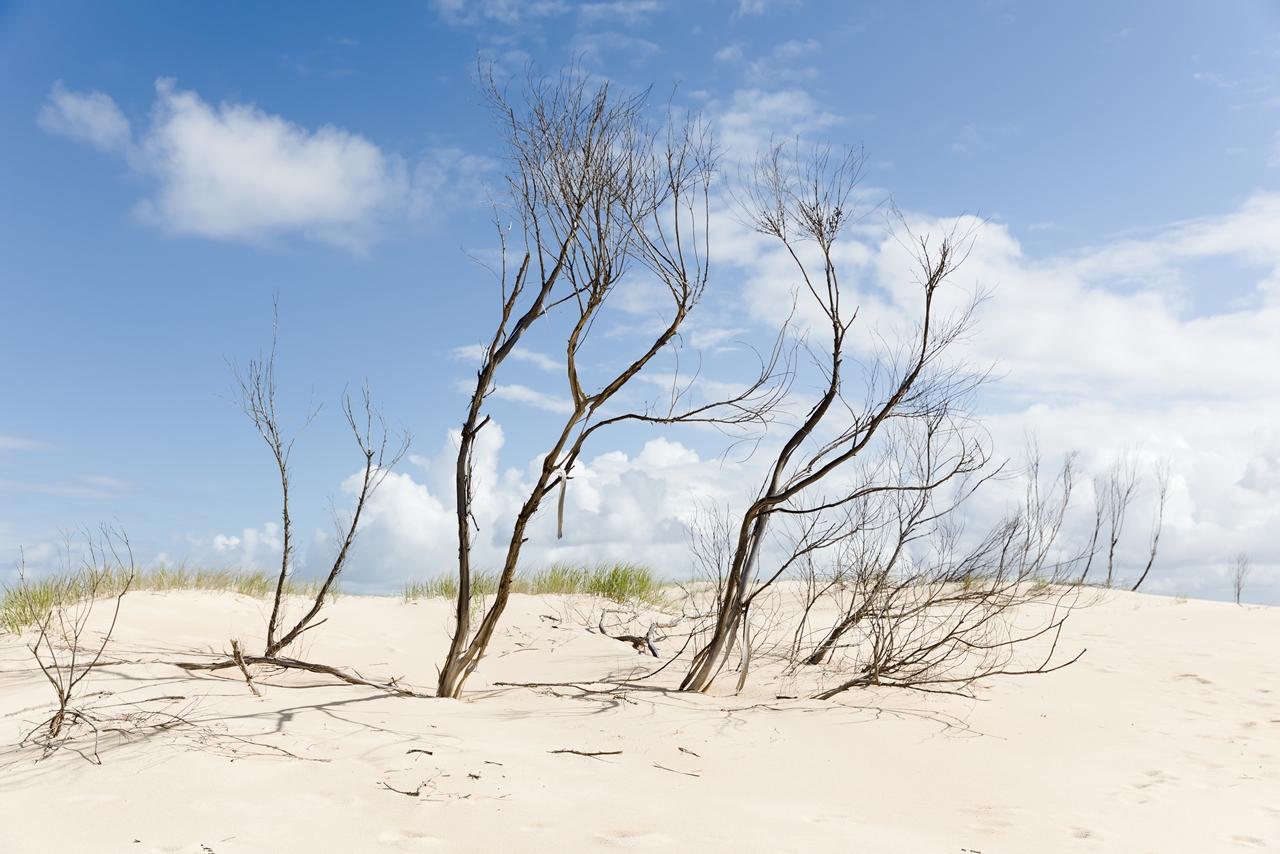
Another shot taken from the Hawks Nest Dunes.
I had a bit of difficulty in choosing which version to go for; hence both being included.
The monochrome version has a nice contrast to it. The barren vegetation becomes more hard against the sand and sky and seems to take control of the image.
The shape and texture comes forward and the image seems striking.
The colour version still features the vegetation front and centre, but the image is much more relaxed. There’s a bit more detail on the vegetation and the softer colours ease things a bit.
The colour version of this photo is now available as a print here.
I hope you enjoy.


FWIW I prefer the BW image.
LikeLiked by 1 person
It’s fine either way.
LikeLiked by 1 person
Wow. Yeah. Nice BW contrast. Good choice of subject too, IMO. I went to a presentation last night on BW landscape photography. You can have both stunning color and BW from the same shot. Quite noteworthy what you can do with BW.
LikeLiked by 1 person
Glad you think so. Usually I go for one or the other as I feel one works better for the image and whatnot.
Moncohrome is very versatile. I like the ways that it challenges how you think about a shot.
LikeLiked by 1 person
Pingback: Dune Vegetation | Stupidity Hole
Pingback: Stabilising Sand | Stupidity Hole
Pingback: Dark Point Aboriginal Place | Stupidity Hole