
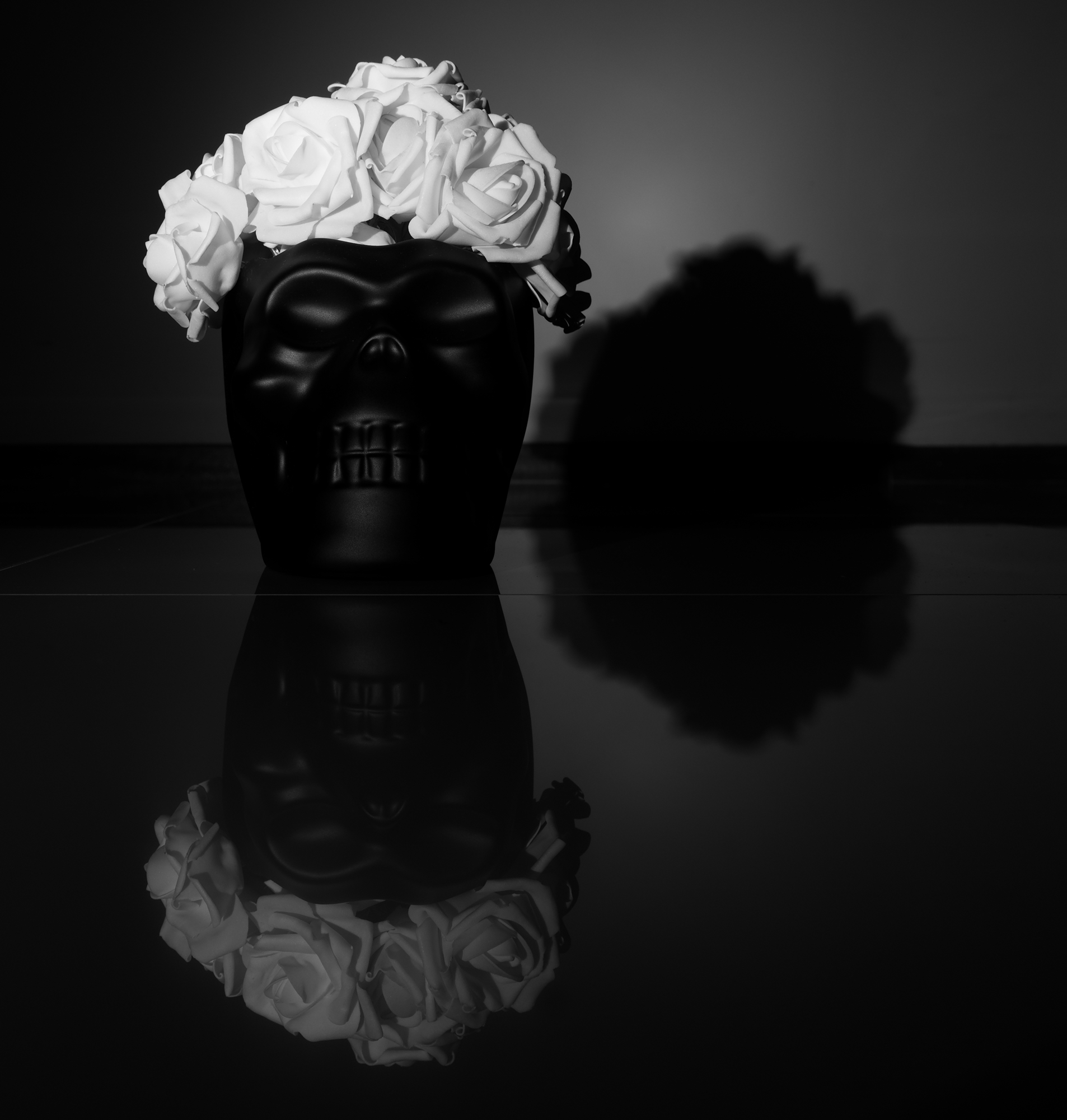
From this angle the skull looks a little more goofy, I think.
This was taken around the same time as yesterday’s photo. With this one I was trying to align so that it appeared larger and a little more behind the skull than it appears here. It didn’t quite work out, but I think in terms of light contrast the photo works. I also think the flowers mostly came out really well; They’ve a good deal of clarity.
This is my submission into Leanne Cole‘s “Monochrome Madness” for this week. Participating is pretty straightforward and something I recommend. If you do, then include the tag “monochrome-madness” in your post.
If not participating, then at the least check out Leanne’s photography as well as what other people submit.
A lot of what people are submitting will likely end up here.
I hope you enjoy.


Kinda creepy, lol, but I like the way you really have to look at it.
LikeLiked by 1 person
It does draw the eye in a bit, if only to make out some of the skull’s details.
As a side note I tried sticking something underneath the skull to angle it a bit so it wouldn’t look so flat at the base, but it didn’t quite work out.
LikeLike